
Walk into any office and you’ll form impressions within seconds – and color plays a larger role in shaping those impressions than most business owners realize. The palette you choose for walls, furniture, and accents doesn’t just affect aesthetics. It signals messages about your company’s personality, values, and the kind of environment you’re trying to create.
This matters whether you’re running a law firm in Raffles Place, a creative agency in one-north, or a tech startup in Tanjong Pagar. Your color decisions contribute to how clients perceive your professionalism and how your team feels about showing up each day.
But it’s not about following rigid color psychology charts or picking shades because they’re trendy. It’s about understanding what different color approaches actually communicate in a commercial workspace, and then making intentional choices that match your reality.
What Neutrals Actually Tell People
Grey, white, and beige dominate Singapore offices for practical reasons. They photograph well, don’t show dirt quickly in our humid climate, and create a professional backdrop that works for most industries. But neutrals aren’t as neutral as they seem – they still send messages.
An all-white office feels clean and minimal, which can read as modern and efficient. It can also feel sterile or impersonal if there’s nothing to warm it up. Many clients visiting an entirely white office might perceive a company that values precision and order, possibly at the expense of creativity or warmth.
Grey has become the default for professional services firms. It signals seriousness without the starkness of pure white. But too much grey throughout can make a space feel heavy or dreary, particularly in interior areas that don’t get natural light.
Beige and warm neutrals create a softer impression. They’re still professional, but more approachable than cool greys. This works well for businesses where client relationships involve trust and personal connection.
The risk with an all-neutral palette isn’t that it’s wrong, but that it might not say anything specific about who you are.
How Color Accents Change the Conversation
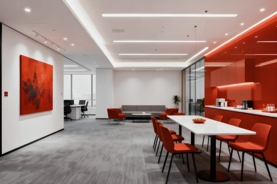
Most offices don’t need full-color walls to create personality. Strategic accents do the work while keeping the space grounded. A reception area with a bold accent wall, colorful artwork, or vibrant furniture pieces immediately signals that you’re not trying to be invisible.
Blue accents show up constantly in corporate offices because blue reads as trustworthy and stable. There’s a reason financial institutions love it. But blue varies wildly in effect – navy feels traditional and serious, while bright blues read as energetic and tech-forward.
Green has become more common as companies want to signal environmental consciousness or wellbeing focus. It works well in break areas or spaces designed for focused work. In Singapore, where we’re surrounded by urban density, green touches can provide a psychological link to nature that people find refreshing.
Red accents are tricky. They create energy and grab attention, which works in spaces designed for activity. But red can also increase stress if overused, particularly in spaces where people need to concentrate.
Yellow and orange bring warmth and optimism. They can make a space feel friendly and creative, which suits agencies, startups, and businesses where innovation matters. But these colors need careful handling – too much intensity can feel overwhelming.
When Your Brand Colors Should and Shouldn’t Dominate
Many businesses assume their brand colors should appear prominently throughout their office. Sometimes that works beautifully. Often it doesn’t.
If your brand colors happen to be adaptable shades that work well in interior spaces, great. But if your logo is bright purple or electric orange, painting entire walls those colors might create a space that’s exhausting to occupy daily. Your team members need to work there eight hours a day, not just visit for a meeting.
A better approach uses brand colors as accents – in artwork, feature walls, or furniture pieces – while keeping the majority of the space in colors that people can live with long-term. You can find ways to reference your brand palette without letting it overwhelm the physical environment by working with commercial interior designers like Design Bureau.
The reception area is different. This is where brand presence matters most, because clients are forming first impressions. If your brand colors work spatially, use them boldly here.
How Color Affects Your Team’s Daily Experience
Clients see your office occasionally. Your staff experiences it constantly, and color affects their psychological state more than most employers consider.
Spaces where people need to focus benefit from calmer colors. Too much visual stimulation becomes distracting when you’re trying to concentrate. Soft blues, gentle greens, or warm neutrals create environments where your team can actually think.
Collaborative spaces can handle more color energy. If you want meeting rooms to feel dynamic and encourage active discussion, brighter or bolder colors support that goal.
Break rooms and social areas are where you can afford to be more playful. These spaces should feel different from work zones – that psychological shift helps people actually relax during breaks.
Don’t underestimate the effect of color on perceived temperature. In Singapore’s climate, where air conditioning runs constantly, cooler colors like blues and greens can make spaces feel fresher.
The Undertone Problem Nobody Talks About
Here’s where many office color schemes fall apart: undertones. You might choose what looks like a simple grey or beige, but under your office’s specific lighting conditions, it reads as purple-grey or green-beige. This happens constantly in commercial spaces, and it’s jarring.
Fluorescent lighting, which still dominates many Singapore office buildings, particularly affects color appearance. It tends to enhance cool tones and deaden warm ones. What looked like a warm beige in the sample becomes cold and grey under your office lights.
LED lighting has different effects depending on the color temperature you’ve chosen. Warm LEDs enhance reds and yellows; cool LEDs enhance blues and greens.
Test your color choices in the actual space, under the actual lighting, before committing to entire walls. Paint large sample boards and look at them at different times of day.
What Different Industries Actually Need
Professional services firms – legal, accounting, consulting – benefit from restrained color palettes. Their clients are trusting them with significant matters and fees, and the environment should communicate competence and stability.
Creative industries can and should push further. If you’re selling creative services, your office itself is evidence of your creative thinking. Design Bureau, a commercial interior design company in Singapore, often helps creative firms strike the balance between memorable and functional.
Tech companies occupy a middle ground. They want to signal innovation and energy, but they’re also competing for talent and need spaces that people find pleasant long-term.
Healthcare and wellness businesses benefit from colors that actually create calm – gentle blues and greens work, as do warm neutrals.
Color in Small Versus Large Spaces
In a compact office, dark or intense colors can make the space feel even smaller. Light colors expand perceived space, which matters when you’re working with limited square meterage in high-rent areas.
But all-white small spaces can feel like storage closets. Adding color through furniture, artwork, or a single accent wall gives the space personality without closing it in.
Large open offices face the opposite problem. Too much of a single light color across a huge space can feel institutional. Here you can use color to define zones – warmer tones in social areas, cooler tones in focus zones. Color becomes a wayfinding tool as much as an aesthetic choice.
Making Changes Without Starting Over
If your current color scheme isn’t working, you don’t need to repaint everything tomorrow. Start with the spaces that matter most – reception areas, main meeting rooms, and circulation paths that clients see.
Furniture and accessories offer reversible ways to shift color balance. New seating in a meeting room, different artwork, or updated window treatments can substantially change how a space feels without touching the walls.
Feature walls give you the option to test bolder colors without committing entire rooms. One wall in a deeper or brighter color can shift the whole space’s character while giving you an exit strategy if it doesn’t work out.
Whatever you do, make color decisions deliberately rather than defaulting to whatever was already there. Your office colors are saying something about your business whether you intend them to or not. You might as well control that message.